

July 18, 2026
World Cup Marketing: Branding Lessons from Argentina and Spain
Discover how Argentine passion and Spanish precision in the World Cup reveal powerful branding and design strategies for your business.
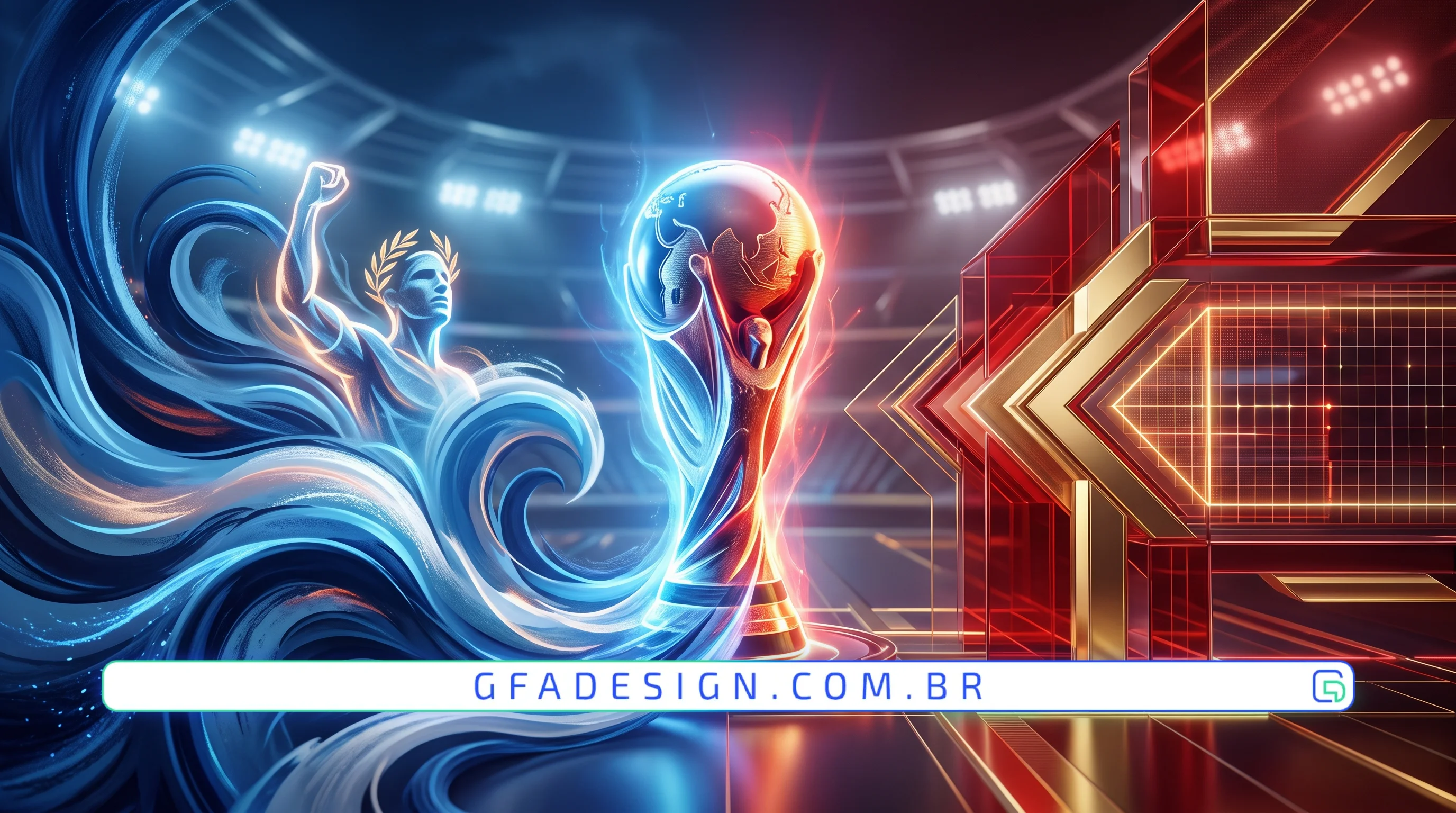
Discover how Argentine passion and Spanish precision in the World Cup reveal powerful branding and design strategies for your business.
The World Cup is the greatest sporting stage on the planet, but it also represents the pinnacle of global marketing. When we analyze World Cup marketing from Argentina and Spain, we notice two completely distinct and highly effective branding schools.
On one side, we have the visceral passion and heroic narrative of Argentina. On the other, we see the technical precision, modernity, and institutional consistency of Spain. Both national teams demonstrate how design and brand strategy build billion dollar legacies.
The marketing of the Argentine national team focuses on pure emotion, overcoming obstacles, and deep human connection. Argentina's brand revolves around strong symbols, such as the blue and white colors, and the almost mythical status of its greatest idols.
They sell heroism, turning every match into a historic battle. This emotional connection generates massive engagement, causing fans worldwide to purchase their jerseys and consume their licensed products.
The Argentine brand capitalized on the feeling of belonging brilliantly. During global campaigns, partner brand associations do not just focus on soccer, but on the country's culture, food, music, and resilience. This powerful storytelling creates an extremely profitable commercial ecosystem.
Our experience building corporate solutions for clients shows that brands touching the audience's heart create loyal advocates, not just casual consumers.
Spain adopts a sports marketing approach focused on sophistication and structured modernity. Known as La Roja, the Spanish national team uses clean design, modern typography, and extremely professional digital communication.
The Spanish focus lies in collective strength, refined technique, and visual consistency across all touchpoints. Their marketing functions like a high performance corporate machine, communicating innovation and authority.
Spain focuses heavily on renewing its graphic brand. Recently, the Royal Spanish Football Federation updated its visual identity to a minimalist design, focused on perfect digital application. This transition facilitated the brand's presence in apps, streaming broadcasts, and esports platforms, attracting a younger and more tech savvy audience.
As experts in digital conversion, we always recommend that visual identity be clear and structured, as technical clarity generates immediate trust in the B2B market.
The main lesson from World Cup marketing from Argentina and Spain is the perfect balance between emotion and technical structure.
That is exactly why, here at GFA Design, we treat this detail as a top technical priority in our development and corporate branding projects.
Elite sports marketing teaches us that strategic design is the engine that transforms attention into real revenue.
If your company seeks to position itself as a market leader, you need a striking visual identity and a high performance website that converts visitors into clients.
Get in touch with the specialists at GFA Design today and discover how we can elevate your business through premium design.
I work with strategic design to position your company and attract the right clients.
Explore branding & web design services