

July 9, 2026
Serif vs. Sans-Serif Fonts: A Graphic Design Guide
Unravel the world of serif and sans-serif fonts! Learn when and how to use each to impact your brand and enhance readability.
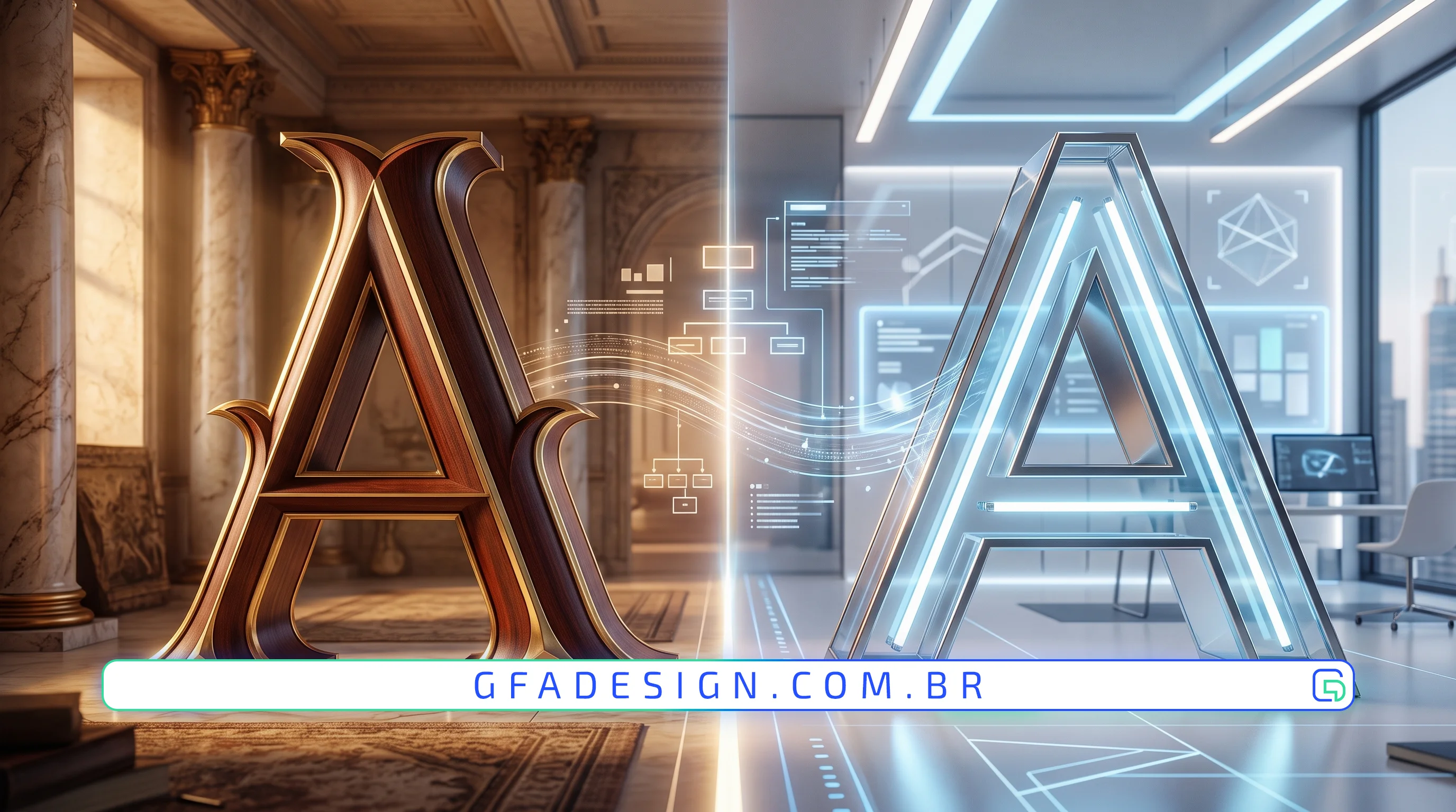
Unravel the world of serif and sans-serif fonts! Learn when and how to use each to impact your brand and enhance readability.
In the vast universe of graphic design, every detail counts towards building a strong and effective visual identity. Among the most crucial elements, typography choice stands out, dictating not only readability but also a brand's personality and perception. Two styles dominate this landscape: serif and sans-serif fonts. Understanding the difference between serif and sans-serif fonts is fundamental for any project, be it a website, a logo, or printed material.
Serif fonts are easily recognizable by the small strokes or "feet" that adorn the ends of letters. Originating from Roman inscriptions, where scribes carved letters into stone and serifs helped "clean up" the edges, they carry a heritage of tradition, formality, and elegance.
That is exactly why, here at GFA Design, we treat this detail as a top priority in our visual identity projects. Choosing the right serif can profoundly and impactfully communicate a brand's story and values, establishing an immediate connection with the target audience.
In contrast, sans-serif fonts (from the French "sans," meaning "without," and "serif") are devoid of these adornments. They emerged later in typographic history, gaining popularity in the 20th century with the rise of modernity and the need for clarity and simplicity in new communication media.
The choice between serif and sans-serif goes beyond aesthetics; it directly influences user perception and behavior. Serif fonts tend to be seen as more serious, trustworthy, and established, while sans-serifs are perceived as more friendly, innovative, and accessible.
Our experience creating high-performance graphic design and web development solutions for clients shows that strategically combining these two font types can create powerful visual hierarchies and effectively guide the user's eye. For example, using a serif for headings and a sans-serif for body text can balance tradition and modernity, optimizing readability in various contexts.
The final decision on which font type to use is not arbitrary. It must align with the brand's personality, target audience, and context of use. As experts in the field, we always recommend a deep analysis and usability testing to ensure that the chosen typography is not only aesthetically pleasing but also functional and consistent with business objectives. GFA Design is ready to transform this choice into a competitive advantage for your company, creating visual identities that communicate with clarity and impact.
The difference between serif and sans-serif fonts is more than a matter of style; it's a powerful tool in the design arsenal. By understanding their origins, characteristics, and the psychological impact each exerts, designers and entrepreneurs can make more informed typographic choices, building stronger brands, communicating messages more effectively, and providing a superior user experience. Remember: typography is your brand's voice in the visual world.
I work with strategic design to position your company and attract the right clients.
Explore branding & web design services