
October 22, 2026
Saturated or Pastel Logos: The Definitive Guide
Discover how to choose between saturated and pastel colors in your brand identity to attract clients and increase conversions.
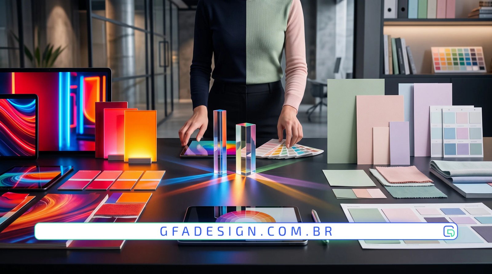
Discover how to choose between saturated and pastel colors in your brand identity to attract clients and increase conversions.
The color choice for a corporate identity goes far beyond pure aesthetics. Each hue triggers specific mental responses in consumers, dictating whether a company projects an image of energy or serenity, innovation or centuries-old tradition.
Our experience building corporate solutions for clients shows that the decision between a vibrant or soft palette defines the success of market positioning. Color studies must align the essence of the business with target audience expectations, ensuring relevance and memorability.
Understanding the technical and psychological difference between saturated and pastel tones is the first step toward building solid brand equity. The right choice shields companies against passing trends and guarantees consistency across all digital touchpoints.
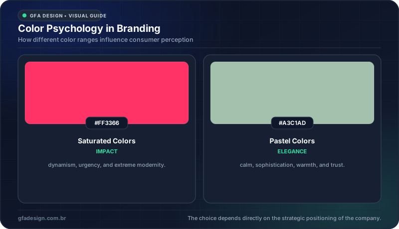
Comparison between the visual impact of saturated and pastel palettes in design.
Highly saturated colors carry a vibrant and intense load, capable of capturing user attention in milliseconds. They are widely used by technology companies, fast-growing startups, and brands that want to convey dynamism and modernity.
That is exactly why, here at GFA Design, we treat this detail as a top technical priority in our projects, carefully evaluating application across different screens and backgrounds. Very strong tones require caution to avoid causing visual fatigue or aesthetic pollution across company communication channels.
When applied strategically, these colors drastically increase visual recognition rates. They act like a magnet for the gaze, making the logo stand out amid the visual noise of competitors on social media and digital platforms.
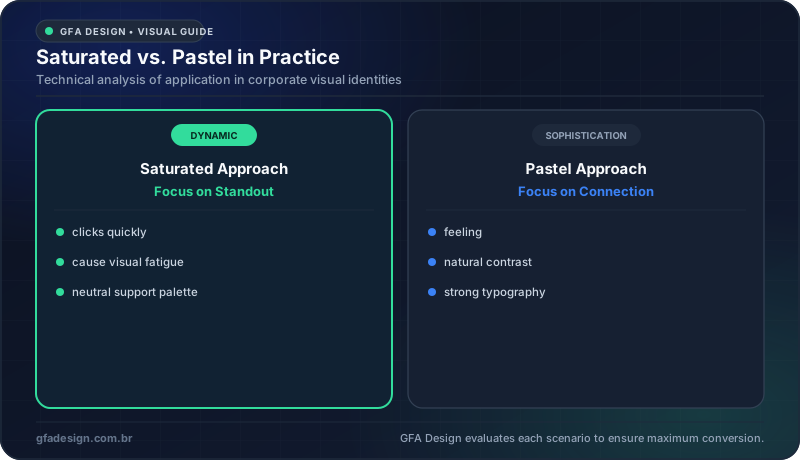
Advantages and precautions when choosing between the two color universes.
In contrast, pastel colors offer a visually lighter, softer, and more refined approach. They convey feelings of calm, trust, and accessibility, making them the perfect choice for brands in wellness, architecture, gastronomy, and aesthetic sectors.
As digital conversion experts, we always recommend that soft palettes be paired with strong and legible typography. This prevents brands from losing authority and guarantees flawless readability on smartphone screens or high-quality corporate print materials.
The softness of these tones generates deep emotional connections with audiences seeking exclusivity and humanized service. The result is timeless design that bravely withstands the test of time without looking outdated.
The final decision between intense saturation and pastel softness should be guided by business strategy and the ideal consumer profile. Analyzing direct competitors helps find visual gaps where your brand can claim a unique and proprietary space.
Our multidisciplinary team performs rigorous contrast testing, grayscale applications, and multiplatform usability checks before approving any visual identity. This ensures the design looks stunning on computer screens and remains functional in the real world.
Your brand color choice is a direct investment in the perceived value of your business in the market. If you want to elevate your visual identity and rely on design focused on real results, reach out to us today and discover how we can help your company grow.
I work with strategic design to position your company and attract the right clients.
Explore branding & web design services