
July 9, 2026
Ideal Logo Typography: The Definitive GFA Design Guide
Discover how to choose the perfect typography for your logo. A GFA Design guide to creating an impactful and memorable visual identity.
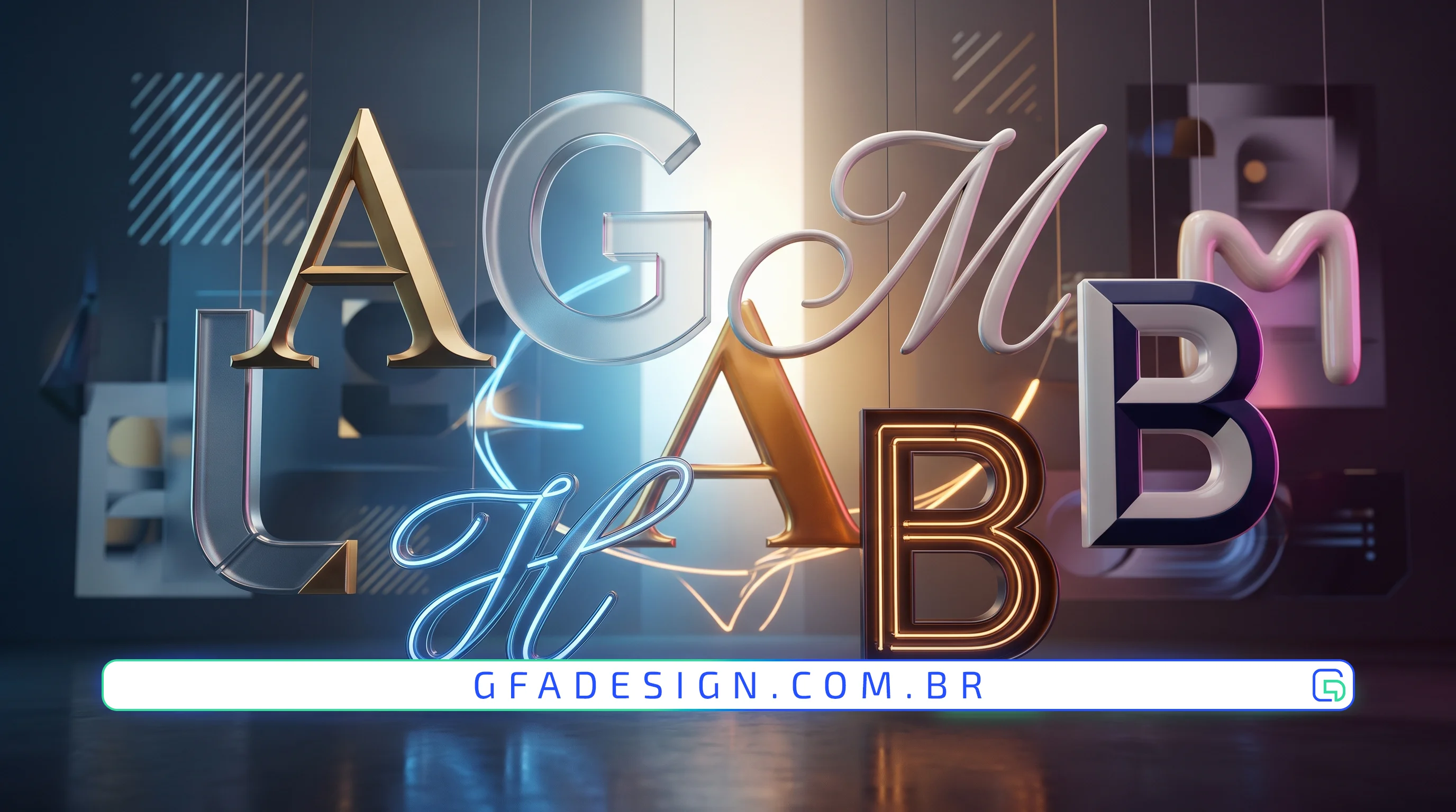
Discover how to choose the perfect typography for your logo. A GFA Design guide to creating an impactful and memorable visual identity.
In the world of branding, your logo is the face of your brand. And within that face, typography plays a crucial, often underestimated, role. It's not just about choosing a "pretty" font; it's about selecting an element that instantly and effectively communicates your company's essence, values, and personality. A well-chosen typeface can differentiate you from competitors, build trust, and create a lasting emotional connection with your audience.
Here at GFA Design, we understand that typography is the silent voice of your logo. That is exactly why, in our visual identity projects, we treat this detail as a top priority, analyzing every nuance to ensure your brand speaks the right language.
Your logo's typeface is the first impression, the first conversation. It sets the tone, emotion, and perception of professionalism or innovation. A poorly chosen typography can convey the wrong message, confuse your audience, or, worse, make your brand appear amateurish or outdated.
Each font category carries a set of associations and feelings:
Our experience creating visual solutions for clients across various sectors shows that the intelligent combination of these types can create truly memorable results.
Just like colors, the shapes of letters influence perception. Fonts with rounded corners convey softness and friendliness, while those with sharp angles suggest strength and dynamism. As experts in the field, we always recommend a thorough study of the psychology behind each stroke to perfectly align the brand's message.
In some cases, a logo can benefit from the combination of two or more fonts. The secret lies in creating a harmonious contrast, where one font complements the other without competing. For example, a serif font for the main name and a sans-serif for the tagline, or vice-versa.
Choosing the typography for your logo is an investment in your brand's identity and future. It's a process that demands knowledge, sensitivity, and a strategic eye. At GFA Design, we are ready to guide you on this journey, transforming your vision into a logo that not only looks good but communicates with power and precision, propelling your brand to success.
I work with strategic design to position your company and attract the right clients.
Explore branding & web design services