

July 9, 2026
How to Use Complementary Colors in Your Brand Design
Discover how complementary colors can transform your visual identity and attract more clients. Learn to use them with balance and impact.
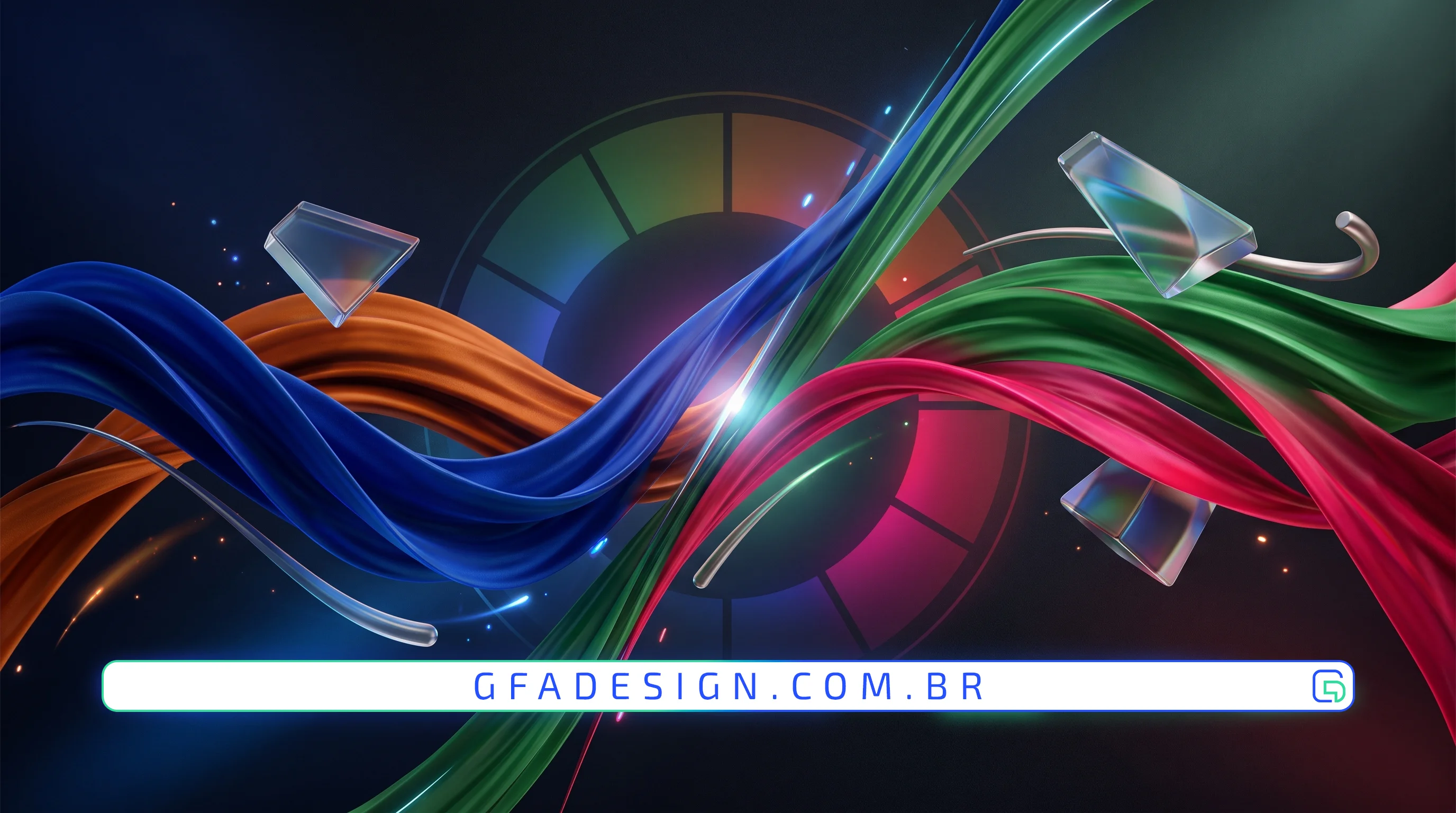
Discover how complementary colors can transform your visual identity and attract more clients. Learn to use them with balance and impact.
In the vast universe of graphic design and branding, choosing the color palette is one of the most decisive factors for a project's success. Among the various chromatic harmonies, complementary colors stand out for their power of visual attraction and dynamic contrast.
Complementary colors are those located exactly opposite each other on the color wheel. Classic examples include blue and orange, red and green, and yellow and purple. When placed side by side, they create a high-intensity contrast, making both tones appear more vibrant and alive.
The correct use of these combinations is not just an aesthetic choice, but a profound psychological strategy. The human brain is naturally drawn to contrast, making complementary colors indispensable tools for directing user attention.
Our experience creating solutions for clients shows that the strategic use of complementary colors is the secret to making a brand stand out in saturated markets. When applied with purpose, they convey energy, modernity, and instant professionalism.
Although contrast is highly appealing, too much of it can cause visual fatigue if not managed well. To create a harmonious composition across your digital and physical touchpoints, we recommend following a few best practices:
As experts in the field, we always recommend that the complementary color be applied strategically to direct conversion elements, such as call-to-action (CTA) buttons, promotional banners, and product highlights. This guides the visitor's eyes exactly where you want to drive action.
Creating a striking visual identity requires technique, rigorous testing, and artistic sensitivity. The balance between complementary colors and neutral elements is what differentiates an amateur design from a high-converting interface.
That is exactly why, here at GFA Design, we treat this detail as a top priority in our projects. We develop exclusive visual identities and high-performance websites that utilize color psychology to generate real value and results for your business.
I work with strategic design to position your company and attract the right clients.
Explore branding & web design services