

November 5, 2026
Bento Grids: The Trend Elevating Corporate Website Design
Discover how Bento Grids are revolutionizing UI and digital branding by organizing complex information with elegance and high performance.

Discover how Bento Grids are revolutionizing UI and digital branding by organizing complex information with elegance and high performance.
Digital design is constantly evolving. In today's landscape, the organization of information has become a brand's greatest competitive advantage. Bento Grids, inspired by traditional Japanese meal boxes, emerged as a sophisticated response to the need for displaying multiple pieces of content harmoniously and intuitively. This trend, popularized by giants like Apple and Microsoft, allows companies to communicate various value pillars at a single visual glance.
At GFA Design, we observe that this modular structure is not just an aesthetic whim, but a powerful tool for visual hierarchy. By segmenting information into rectangular blocks of varying sizes, we can guide the user's eye with surgical precision. This is fundamental for B2B companies that need to present complex data, software features, or robust portfolios without overwhelming the visitor.
The adoption of this layout reflects a shift toward clarity. Instead of long, exhausting scrolls, the user finds a dashboard of possibilities. This structure respects the user's time and intelligence, providing a direct path to the most relevant information for their specific needs.
The main advantage of this approach is its incredible capacity for adaptation. In a world where mobile access surpasses desktop, the modular structure facilitates responsive design. Each module of the grid can be rearranged fluidly, maintaining the integrity of the message on any screen size. Furthermore, the clean aesthetic and rounded corners convey a sense of modernity and cutting-edge technology.
As experts in digital conversion, we always recommend this structure when the goal is to increase time spent on the site. The visual curiosity generated by a well-planned grid encourages the user to explore each quadrant, transforming passive browsing into an interactive experience. Visual clarity reduces cognitive load, which allows your brand's value proposition to be absorbed much faster.
Moreover, the flexibility of the grid allows for a mix of media. You can combine static images, short videos, and interactive text within the same visual framework. This variety keeps the user engaged for longer periods, which is a key metric for SEO and brand recall.
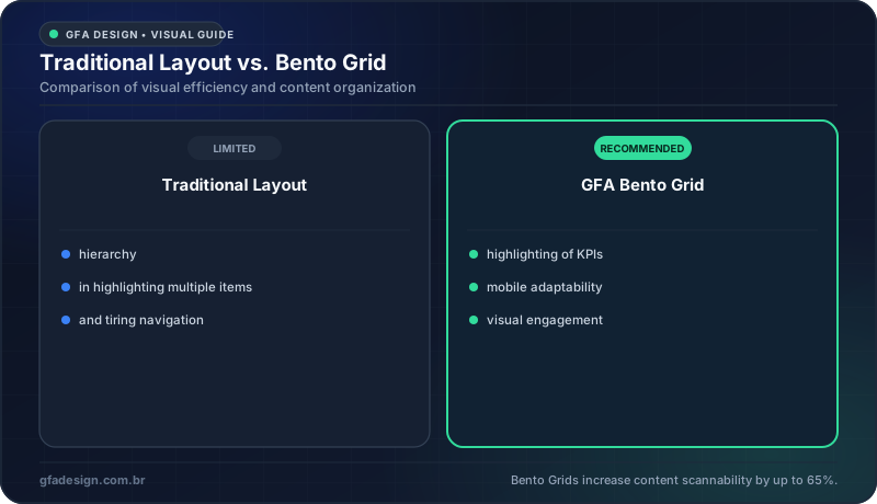
Bento Grids offer a much more balanced visual weight distribution for modern brands.
The design of a website is, quite often, the first handshake between a company and its potential client. A disorganized interface communicates a lack of processes and amateurism. On the other hand, the strategic application of Bento Grids projects an image of organization, innovation, and attention to detail. It is exactly why, here at GFA Design, we treat information architecture as a top technical priority in our UI/UX projects.
Beyond aesthetics, there is an important psychological component. The human mind seeks patterns and order. When we deliver content in well-defined blocks, we facilitate brand memorization. Each cell of the grid can be used to highlight a testimonial, a success metric, or an exclusive feature, ensuring that no important selling point is ignored by the lead during the buyer's journey.
This methodology also improves accessibility. Screen readers and assistive technologies benefit from a clear, logical structure. When a site is easy to navigate for everyone, it not only fulfills a social responsibility but also broadens the reach of your corporate message to a wider audience.
To implement this trend successfully, one must go beyond the simple arrangement of boxes. It requires a deep study of visual weights. The most important elements must occupy larger areas or possess highlight colors, while secondary information fills the smaller spaces. The balance between negative and filled spaces is what separates a professional website from an amateur one.
Our experience building corporate solutions for clients shows that the integration between branding and the modular interface must be perfect. Institutional colors, proprietary typography, and custom icons must inhabit these modules cohesively. It is not just about placing information in squares, but about creating a visual ecosystem where each piece reinforces the company's authority in the market.
Finally, it is vital to consider the narrative flow. Even in a grid, there should be a logical sequence. The user should feel that they are being guided through a story about your company, starting from the core problem you solve to the final call to action.
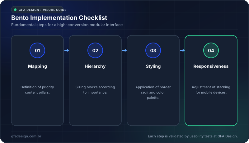
The technical process ensures that aesthetics do not compromise functionality.
High-performance design is that which unites aesthetic beauty with tangible business results. Bento Grids are just one of many tools we use to ensure your company stands out in a saturated market. If your current website does not reflect the innovation and quality of your services, it is time for a strategic evolution. Reach out to the team of experts at GFA Design and let us build a visual identity together that converts and positions your brand at the top.
I work with strategic design to position your company and attract the right clients.
Explore branding & web design services